Design
Overview
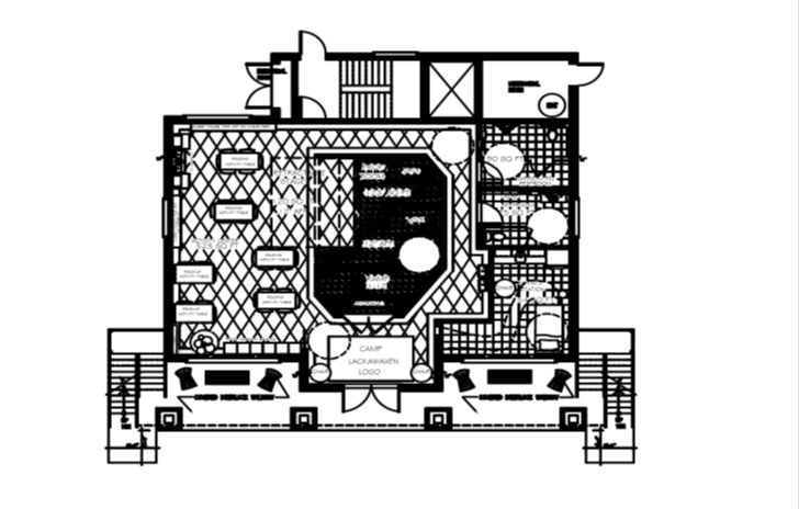
The main entrance of the camp
is surrounded by quarter-sawn timber columns with a river rock masonry base.
The structure is entered on the north side with a “zero-step” threshold
allowing for campers with special needs to enter without incident. The timber
columns rise up to support the covered balcony overhead. On the floor in the
vestibule is the logo of Camp Lackawaxen. Also on the floor are carpet floor
tiles installed in a diamond pattern in the concept colors green, blue, and red
with two shades of gray neutrals to ground the design. The two shades of gray
will outline the perimeter which will aid visually challenged youths to
navigate through the space.
To the left
is the activity center. The activity center was placed here to take advantage
of as much square footage as possible. Three walls with many windows
surrounding the activity center offer ample lighting into the space. The
ceiling height is over ten feet. Entering the activity center to your right you
will see the stage “wall”. This is where the stage is housed when not in use.
It has a roller shade concealing the stage. Behind the stage is the prop area
with changing areas for boys and girls. This was placed in this area for direct
access back and forth from the stage. At the back of the activity center is the
art storage areas with a sink for cleanup. Going past the stage is a hallway
that leads outside and to the other side of the 1
st floor. The
restrooms are located here with easy access in any direction the campers wish
to go. Past the bathrooms on the right is the nurse’s station. The nurse’s
station is placed near the front entrance because of the need for it to be
adjacent to the front entrance.
No comments:
Post a Comment