Thursday, December 12, 2013

God Bless Mary's House


Hi bloggers,

Wow! What a semester. I think this semester can be best summed up by some favorite words from my fabulous and cute as a button great nephew, Brayden,  “Are you kidding me right now…? (He just turned 3) I wanted to share with you a recent design in residential design II that I have been working on with my good friend and amazing designer, Gina Hicks.  We recently went to a homeless shelter in Greensboro, NC to visit Craig Thomas who is the executive director for Mary’s House, http://www.maryshousegso.org/. Mary’s House is a home where mothers and their children who are struggling with homelessness and substance abuse can come and get a fresh start. Our entire class broke up into two person teams to tackle each room on the lower floor. Gina and I chose the dining room because we have fond memories from our childhood of being at the table and we wanted for these families to be able to gather and eat, talk about their day, do art, and just enjoy each other. Our class decided on an uplifting color theme and concept for the space. We wanted it to feel happy, inspiring, and safe. We chose colors of yellow, orange, light blue, and teal. 


Gina and I were off to the races when I found these inspirations on Pinterest for our ceiling treatment and storage options and I was hoping she would like them and she did!


We wanted to give the dining room much needed storage and really make the wall where we planned to place the cabinetry to be a focal point. We kept the cabinetry a simple shaker style with white quartz tops and Clayhaus 2" x 8"  tiles from Modwalls, in the colors of splash, cookie, milk (matte), goldfish, zest, and teal agate for the backsplash. We placed a large section of open cabinetry in the center to house the coffee makers and microwaves and storage. 


 Speaking of storage we found these amazing entry cabinets from Ballard Designs which will help with some issues they have with not having much space in their entry way, (which is right outside the dining room), to put coats and backpacks, etc. We placed two of them right inside the door of the dining room to your right so that the kids coming home from school can set their backpacks there and have an after school snack in the dining room before heading anywhere else. There is a large drawer in the bottom so they can also house books and art supplies.


   These are our fixtures, furnishings, and equipment for the room. I love this art work that Gina picked out from Etsy and you can’t help but smile when you see and read it. Gina also had some custom art pieces made with acrylic and vinyl letters that will have the 12 step program guidelines on them because this house’s recovery plan is based on those principles.


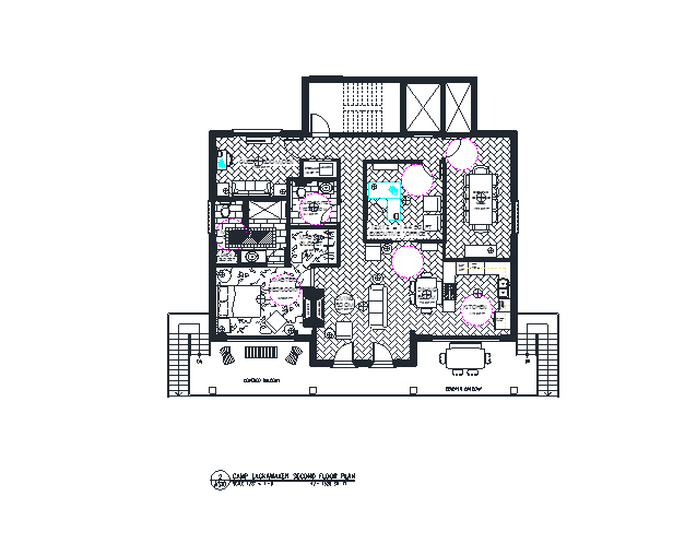
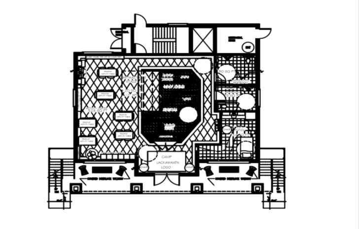
 This is the floor plan for dining room at Mary’s House. The design Gina and I put together really streamlines the dining room giving them plenty of move around space and storage. It also gives them much more function than they had before and our hope is that they enjoy being in here as much as we enjoyed making this space better for them.


These are photos of how the room looks right now and you can see that they really need storage and more function to this dining room space.


 This is the fabulously rendered dining room perspective that my son Josh Pugh a professional photographer helped me with.  You can find him at:  http://joshuathomaspugh.wordpress.com/


One last thing that we presented was the idea that Gina and I had to incorporate the 12 step promises on the steps to the upper floor. These are steps that the women and children go up and down every day and what a fabulous way for them to see these and keep strong in overcoming their adversity. 


We all presented our design to Craig Thomas the executive director of Mary’s House, and a dear friend of hers, Betsy Isley, in our interior design department at Randolph Community College this week. They were really overjoyed at the designs and greatly anticipating the changes to the home that will impact these women’s lives.

Well that’s all I have for you today. Thanks for stopping by my blog today. I hope you have a fabulous day!!

Stop back by and I should have some further information to post about the continuation of this project and links to my friends and classmates blogs about this project.

Monday, November 4, 2013

Take Two!


Hi Bloggers,

I would like to share with you the design for the 2nd floor of this design competition that I have been working on. 

Take a look:

Design Overview – 2nd floor – Camp Lackawaxen
Bernice Bienenstock Furniture Library Design Competition 2013-2014
The second floor of Camp Lackawaxen is accessible from the outside by going up the stairs that are located at the end of the1st floor covered balcony overhead. You can also access the 2nd floor inside at the rear of the activity center on the first floor via the elevator or stairs. On the 2nd floor as you enter from the double doors from the balcony is the living room, dining room, and kitchen. In the living room to your right as you enter is the fireplace with concealed TV above and seating. In the dining room I placed a glass top dining table with bench and chair seating for 6. There is a china cabinet for display and storage. The kitchen is directly behind the dining room. The cabinets are placed in a u-shaped configuration and have varying counter heights for easy accessibility.There is a gas stove top with a down draft feature so a range hood would not have to be used, a wall oven/microwave combo, two dishwasher drawers, and refrigerator.  The kitchen was designed this way to take into consideration the view of these gorgeous Pocono Mountains.  Behind the fireplace wall is the master bedroom which features a stone fireplace of its own with walk-in closet and master bath. The master bath has a large shower, sufficient sink counter space, and linen storage. Just outside the master bedroom is the hallway leading to the guest bathroom. Continuing down the hall to your left is the guest room/den and a laundry/storage area just outside in the hallway. Going to the right in the hallway will take you to the executive office and executive conference room which have accessibility to the stairs and elevator to the 1st floor. In the executive office you can see that there are two pocket doors that allow you to go back into the residential space. While you are working in this office with the doors open you still have your view. I designed the whole second floor with a contemporary cabin feel and concept to keep the view in as many rooms as I could with fixture and furniture placement. I selected comfortable furnishings and I wanted to keep a calm atmosphere so I went with a color scheme to bring the colors of the landscape inside.
The Camp Director is going to be very happy here!

Thanks for stopping by my blog today and I hope you have a FABULOUS day!!


Monday, October 14, 2013

Finishing Touches

Hi Bloggers,
Attached below is just a small sample of the materials and finishes that will be making their way into the Bernice Bienenstock Furniture Library Competition 2014 camp design.
I have chosen these items because I feel that they would be appropriate in the space by their color, content, or application.
I guess my favorite would have to be the Silestone quartz counter tops with their antimicrobial benefits. This counter top, I think, is great with kids. We all know that kids don’t wash their hands like they should and so this counter top will be a great addition to the space.

Have a FABULOUS day today and thanks for stopping by my blog. 


Come on in


Design Overview

The main entrance of the camp is surrounded by quarter-sawn timber columns with a river rock masonry base. The structure is entered on the north side with a “zero-step” threshold allowing for campers with special needs to enter without incident. The timber columns rise up to support the covered balcony overhead. On the floor in the vestibule is the logo of Camp Lackawaxen. Also on the floor are carpet floor tiles installed in a diamond pattern in the concept colors green, blue, and red with two shades of gray neutrals to ground the design. The two shades of gray will outline the perimeter which will aid visually challenged youths to navigate through the space.   To the left is the activity center. The activity center was placed here to take advantage of as much square footage as possible. Three walls with many windows surrounding the activity center offer ample lighting into the space. The ceiling height is over ten feet. Entering the activity center to your right you will see the stage “wall”. This is where the stage is housed when not in use. It has a roller shade concealing the stage. Behind the stage is the prop area with changing areas for boys and girls. This was placed in this area for direct access back and forth from the stage. At the back of the activity center is the art storage areas with a sink for cleanup. Going past the stage is a hallway that leads outside and to the other side of the 1st floor. The restrooms are located here with easy access in any direction the campers wish to go. Past the bathrooms on the right is the nurse’s station. The nurse’s station is placed near the front entrance because of the need for it to be adjacent to the front entrance.